oh godOriginally Posted by CEITEDMOFO

the right one is really hawt
i'd hit that so hard


oh god
the right one is really hawt
i'd hit that so hard

Nice to get this input and correct it on run no.3 of cards. My secretary is working hard in our ad dept .she said comic sans showed up first in her program *shrug* ill get her going harder.I told her all three of your inputs.she knows all yalls cred.
try out a few different typefaces, and different layouts. print them on paper, cos you really need to see how it looks in print before you send the final version to the printers. once you've printed out the different versions on your own printer, you'll be able to see which version works best and then go ahead with that one. by printing several versions you can check for spelling mistakes, layouts and stuff easier, it's a lot less costly then sending something to the printers and then deciding you don't really like it after all or you've found an error.
Don't want no puss filled yellowheaded dick man
Gavin , I wont be reiterating my services because its plain to see with the photos and text I have in this thread. I'm not trying to be overly redundant. PEACE
TELL ME WHICH ONE OF THESE THREE LOOK THE BEST. IM THINKING BOTTOM RIGHT.
I was having this done while you typed this. LOL
I been working all morning. I fell asleep at 6am in the studio and then got up at 1030 am and went to work and put out some more footage on my pages and everything like ALWAYS
1
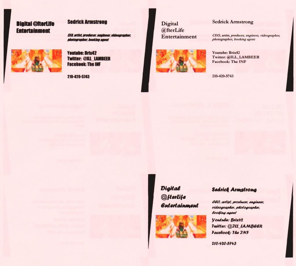
i think i like the top right one the best. the bit with the CEO, artist, etc is a little on the small side.
the one on the left is ok but it's all in bold, would be cool to make certain parts in bold but not the entire text. i prefer the digital @fterlife entertainment on 2 lines rather than 3.
the one on the bottom looks like a calligraphy type of font which is gonna be hard to read in small print. stay away from those types of fonts unless it's a bit of text that is going to be quite large.
maybe try to mix a few different typefaces together, you don't have to stick to one typeface.
also, you're gonna have to line up the image with the text so it looks like it was meant to be there. none of those cards have the image lined up with anything and it looks a bit messy like that.
Last edited by Ol' Dirty Trixˣ; 09-30-2013 at 03:02 PM.
Don't want no puss filled yellowheaded dick man
okay GREAT points. Your points also concur with some other EXCELLENT feedback I am getting via facebook. I really value your opinion Dottie ,because you are a student. You and Robbie is at the top of the list here as far as valued opinion goes because you both are legit. I read Robbie out his work of IT shit he does , one time , and it blew my mind. I even think Han was stumped but would maybe never even admit it. I hold Gavin in high regard as well because he had his own successful business with having clients like yung joc or whathave you..... His clothing line was legit and he comes from a business orientated family.
NO FAKE SHIT UP IN MY MIX AT ALL. GOTTA BE A GO GETTER FOR REAL UP IN THIS BITCH
Im still taking opinions and would actually like to hear from Art and Check2 because I know they are involved on a legit level in the business world. mf's would never suspect that from ch2 cuz he keeps it hush and I aint fixing to tell. He dont even know I know and thats the way we gonna keep it no matter what.
BUSINESS , G...... NEVER PERSONAL - NINO BROWN
def deciding to combo top and bottom right
also top left wouldn't be too bad without bolding but still I think I can see this from the combo of right.
printing up 3rd run of officials tonight
try it with the image on the right hand side.
people naturally read from left to right, so when magazines design their articles, ads, interviews and stuff you'll notice that the image is always on the right hand side of the page and text on the left.
Don't want no puss filled yellowheaded dick man
this was exactly what my class was like when we did our corporate identity project. we all had to design business cards, letter heads, complements slips, etc, etc for a made up business.
we had a choice of different businesses, like a design firm, a furniture shop, a delicatessen and a few others. our final designs had to reflect the business at hand.
Don't want no puss filled yellowheaded dick man
lot of ppl saying top right. the combo is also agreeable as well
going back to my office then off to do some side work (lawns)
don't forget to add your email address, but only if it's a proper email address with your name, or business name. nothing like "wutang4lyfe2783" that'll make you sound like you're 15 years old. a proper business email address should have your name in it.
if you included your email under the bit with your youtube, twitter and Facebook it would line up the image next to the text quite well, it'll look more balanced.
Last edited by Ol' Dirty Trixˣ; 09-30-2013 at 04:28 PM.
Don't want no puss filled yellowheaded dick man
my email is
[email protected]
lots of times when I have customer service calls with companies like for my phone bill or the internet sompany or whatever ... I give them my email and they always compliment it. its funny when I catch christians with that shit because they dont know any better and assume that my professionalism and ppl skills come from lord christ grace when in actuality its the total opposite.
what ever hel[ps ppl slee[p at night I guess lmao
I WILL put the email and if more than 3 of you think I should just create a DigitalAfterLife email or a SedrickArmstrong Email then I will heavily consider it cuz this def aint a game.
*cues up it aint a game (it used to be) youtube*

do the digitalafterlife email, at least that is the name of your business, but your name should be fine, whichever.
using you current email will confuse people since you already have so many different names. it's also a little long winded and harder to remember.
Last edited by Ol' Dirty Trixˣ; 09-30-2013 at 04:39 PM.
Don't want no puss filled yellowheaded dick man
 Posting Permissions


 Reply With Quote


Bookmarks