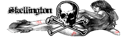
this a logo for my gfx team !
good or not ? lol


this a logo for my gfx team !
good or not ? lol
not. sorry, but where's the logo? looks like an amateur flyer design to me, also, if you're going to put "the best designer" on something, you'd better make sure your artwork is sophisticated, unless you meant it to be ironic?


Originally Posted by NZA
ouch.... harsh but NZA has a point. its not much of a logo but more of a advertisment. not bad... but could use some improvements. for starters... i would make it more of a logo if thats your aim. just a basic shape or form. in its current state.. its not much of a logo. also... try not to use so many different fonts. a few is okay... but have them similar or so that they flow well.
keep at it tho... practice makes perfect!
__________________
yeah, it's a nice graphic, but not to be concidered a logo.
"The only way to a woman's heart is along the pathof torment. I know none other as sure..."
 Posting Permissions


 Reply With Quote


Bookmarks