
Hmmm which one?


Hmmm which one?
That oneOriginally Posted by Sean101


both are too "big" imo
You mean literally too big or like something about them is too big? Because they're the same size as all my other sigs
I'm not a fan of 500x200 signatures, I prefer 400x150, 380x150 b/c the details come out alot better
500x200 sigs need alot of effects and most of the time more than just one render to make them look really good
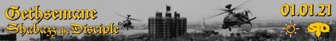
I prefer the bigger ones because you can see everything a lot better and I find it easier to work on a bigger canvas. Here's a smaller version anyway.
Edit: I suppose it does look a little better, actually. Anyway, what do you think of it, forgetting about size?
Last edited by Sean; 09-16-2007 at 03:21 PM.
see? now that shit looks dope, it's a lot better
PS: learn to do smaller sigs; it's a bigger challenge, also they look alot better b/c the effects / backgrounds /render look "sharper", not so stretched u know?
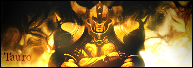
Hmm...I'm not too sure about this one, I went for a different kind of style. What you all think? Feel free to say you straight up don't like it lol.

keep goin', it's the right direction
How do I improve it though? I don't know how to do all these crazy effects that other people have in theirs.
filtering + layer styles + brushing = good background
Ehhh, I changed it a bit. There isn't much more I can do to this one, the render is too big.

Last edited by Sean; 09-18-2007 at 03:55 PM.

It's nice but I don't think it represents Talib very well, looks more like a Boot Camp sig. Stick Buckshot in there or sumthin.
"I pledge allegiance to the hip hop"Method Man
Yeah that's what I was thinking. It goes with that picture though, with the camo hat and dark grey hoody. I can't be bothered to change it now, maybe tomorrow.
How about this one?

Last edited by Sean; 09-18-2007 at 04:57 PM.
you made mos too red imo, the renders aren't flowin well with the background
 Posting Permissions


 Reply With Quote

Bookmarks