01.01.2021
Page 2 of 22 FirstFirst 123456789101112 ... LastLast
Results 16 to 30 of 321

Thread: .::Storm Graphics::.

  1. #16

    Default Nasty Nas

    Last edited by Storm; 10-31-2007 at 03:24 PM.


  2. #17

  3. #18
    El Don of this shit TAURO's Avatar
    Join Date
    Mar 2006
    Location
    In the minds of women everywhere
    Age
    42
    Posts
    16,336
    Rep Power
    72

    Default

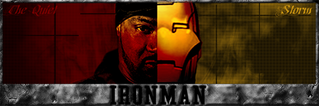
    I love that Iron Man sig, very dope. So obvious that I can't believe no one as done it before.


    "I pledge allegiance to the hip hop"
    Method Man

  4. #19

    Default

    thanks. yea, one day I was thinking bout that and thought it would be a very good concept for a sig. But im gonna redo it a lil' bit. im gonna redo the text so it looks kinda futuristic and metallic and im gonna see if I can find a good cartoon pic of ironman cuz the one I used is the one for the new movie and didnt really like it.


  5. #20
    Suga Duga
    Guest

    Default

    Quote Originally Posted by The Quiet Storm View Post
    thanks. yea, one day I was thinking bout that and thought it would be a very good concept for a sig. But im gonna redo it a lil' bit. im gonna redo the text so it looks kinda futuristic and metallic and im gonna see if I can find a good cartoon pic of ironman cuz the one I used is the one for the new movie and didnt really like it.
    don't make the font in your sig too...umm let's call it "spectacular"....
    a simple font in white is the best way to do it...make sure that the font flows well with the background by using different layer settings and play around with the opacity

  6. #21

    Default

    I know about that stuff but thanks for the tip/info though. Yea, I should've left the text alone but I wanted some color on it. Do you think the text (a simplier text without color) shouldnt be altered or be altered the way I had it


  7. #22
    Suga Duga
    Guest

    Default

    Quote Originally Posted by The Quiet Storm View Post
    I know about that stuff but thanks for the tip/info though. Yea, I should've left the text alone but I wanted some color on it. Do you think the text (a simplier text without color) shouldnt be altered or be altered the way I had it
    no, keep it simple...
    ppl keep overvaluing the text in a sig...it's just a small addition...the texts with all the effects, colors etc. "interrupt" the sig itself...

  8. #23
    El Don of this shit TAURO's Avatar
    Join Date
    Mar 2006
    Location
    In the minds of women everywhere
    Age
    42
    Posts
    16,336
    Rep Power
    72

    Default

    Quote Originally Posted by The Quiet Storm View Post
    thanks. yea, one day I was thinking bout that and thought it would be a very good concept for a sig. But im gonna redo it a lil' bit. im gonna redo the text so it looks kinda futuristic and metallic and im gonna see if I can find a good cartoon pic of ironman cuz the one I used is the one for the new movie and didnt really like it.
    I think the movie Iron Man pic works very well, notice how the Iron Man mouth design matches Ghost's goatee.


    "I pledge allegiance to the hip hop"
    Method Man

  9. #24
    Veteran Member
    Join Date
    May 2007
    Posts
    704
    Rep Power
    18

    Default

    I like almost all the stuff in your first post

  10. #25

    Default

    thanks for the support, do u want a sig?


  11. #26

    Default

    Quote Originally Posted by TAURO, DA GRIM LATIN View Post
    I think the movie Iron Man pic works very well, notice how the Iron Man mouth design matches Ghost's goatee.
    lol, I didn't even notice that.


  12. #27

    Default Chiba 2

    Last edited by Storm; 10-31-2007 at 03:25 PM.


  13. #28

  14. #29

    Default Sleep Sintra

    Last edited by Storm; 10-31-2007 at 03:26 PM.


  15. #30

    Default Ironmen

    Last edited by Storm; 10-31-2007 at 03:27 PM.


Bookmarks

Posting Permissions

  • You may not post new threads
  • You may not post replies
  • You may not post attachments
  • You may not edit your posts
  •