
yeah it looks cool maybe you should start your own thread with graphics snd there post your works?


yeah it looks cool maybe you should start your own thread with graphics snd there post your works?

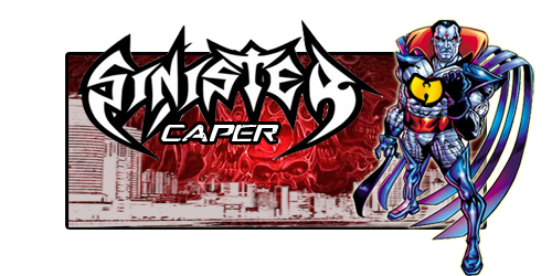
i like the shield action in Caps sig... the edges when it spins up could use som clesning up but it cool to see someone else rockin super heroes.
ill post mine version in a while. i'm not guna up any sigs till i get the Non Ignorants one done first then i'm put up what i been working on lately.
but you got nice work.

as i scroll down the page... your designs get better and better. nice job, keep up the hard work.
__________________

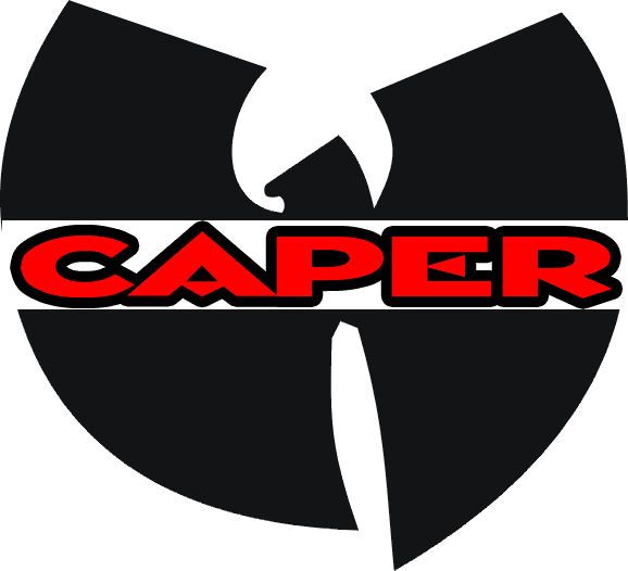
cape u getting better
Last edited by GEE DARK; 08-16-2009 at 10:55 PM.
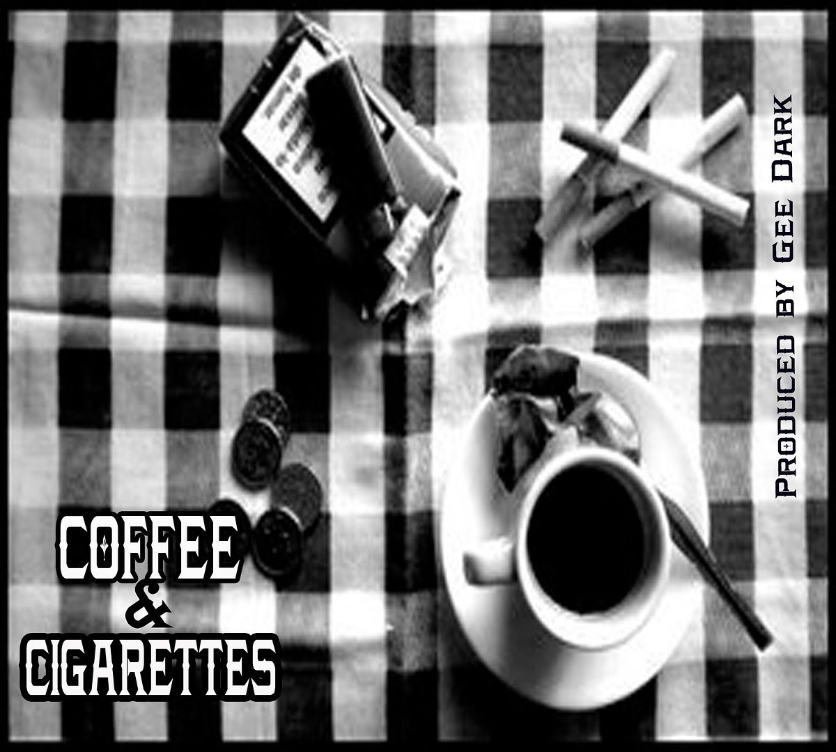
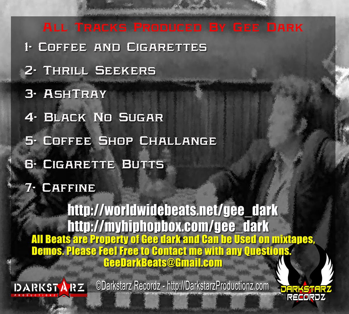
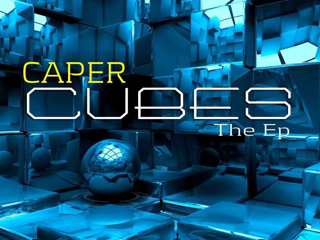
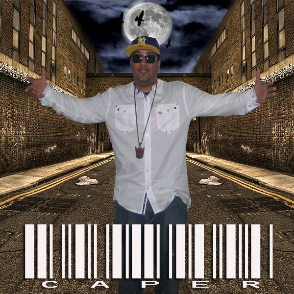
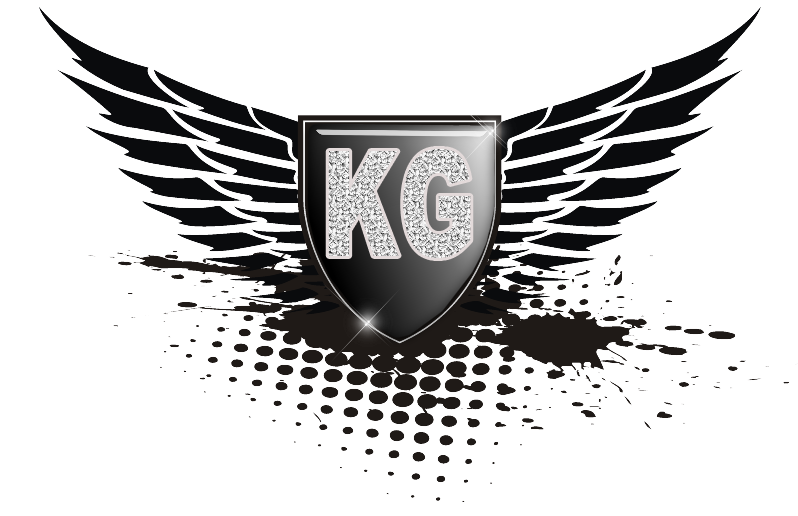
something i did today what do you think?
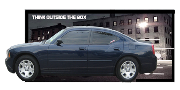
check out my sig
Last edited by Caper; 08-18-2009 at 12:42 AM.
your current sig is nice... i would work on tightening up the border and perhaps trying different fonts. fonts are hard to nail down for sigs... they will either make or break a sig design. overall... pretty good.
__________________
You got enough gas for the drive ,you just need to pointed in the right direction. I recommend tutorials on whatever you like working on : Signatures,flyers ..or whatever . I've learned alot just by playing with it and yet I'm no where near the calliber to some of the catz on this site...you'll learn as you go . The Hardest part for me is being patient .I try to finish things in one session ,instead of working on it and letting it flow ,instead forcing it all together just cuz i wanna fininsh it ..

alot of ill shit on here bro
i need a nu logo
hook this up fa mePCP
SONY HEADFONES MUSICK
SkamPoe at instagram @kinghippoe
FOLLOW!!
I got you
ur logos are pretty bad ass. GJ bro..
Thanks I appreciate itOriginally Posted by Bobby_Digital72

 Posting Permissions

 Reply With Quote


Bookmarks