

What ya think?


What ya think?
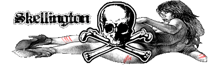
Originally Posted by CharlesJones
Seen better from you, I don't like the main font and how its cut off at the bottom of the sig, and I was going to say, I wasn't feeling the bg much, but it's growing on me.
Your current sig's better tho' imo.
Pz


too much empty space... try finding multiple images, or possibly increasing the size of the current one. that should fill in some of the void. also find some better fonts. dafont.com is a great place to start. also, with your background, try using different brushes to get more texture and depth.
__________________

^^indeed...nice th0
Throw Ya W's Up!
Propz To Sean For Kickin' The God A Siggy
Thnx for comments
ITs ok, its plain to me.
"Who's the wickedest, street officialist, Guess, Gortex
Lex is the crispiest, ice the vidiculous
Peep and look, the unexplainable'll keep ya shook
High illism, the realism got you hooked" AZ - Doe or Die (Rza Remix)
Hmmm, looks like something we've seen dozens of times, but you made it nice tho, but it needs more.
peace
"The only way to a woman's heart is along the pathof torment. I know none other as sure..."
 Posting Permissions

 Reply With Quote


Bookmarks